FUIAccordionItem
The below is a detailed description of the structural components of the FUIAccordionItem widget.

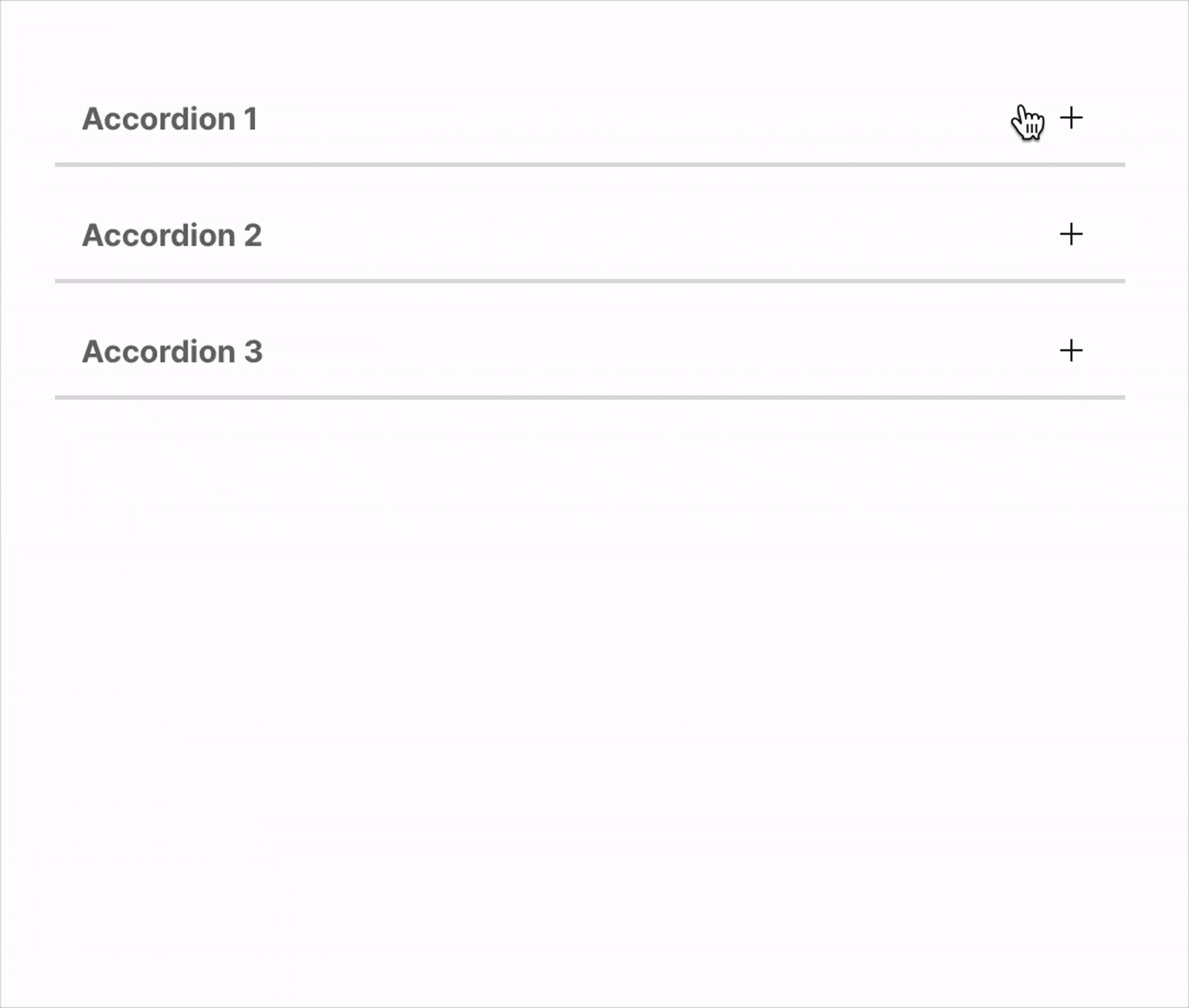
Usage
The accordion item widget can be configured in numerous configurations.
Item head with icon
To include an icon along with the head label, do the following:
Switch positions of icon and label
Very long content, use a scroll view.
Side expansion animation
Enhance the accordion item’s visual appeal with animation. To enable this animation, simply activate the sideDecoExpAniIconEnable option. The animation will play during the expansion and collapse of the accordion item.
The widget employs Lottie files to achieve the animation effect.
Default side deco expansion animated icon
Changing the animated lottie file
If a different animation is desired, please download a Lottie file and configure it accordingly:
Parameters
Parameters | Description |
|---|---|
FUIColorScheme fuiColorScheme | The desired color scheme. Values could be found in the |
bool initialExpanded | Expand when initially build. |
ValueSetter\<bool\>? onAccordionChanged | The function to be triggered as and when the accordion item is expanded or collapsed. |
Text headLabel | The item head label. |
Icon? headIcon | Head label icon (if any). |
FUIAccordionHeadTextIconPosition? fuiAccordionHeadSideIconPosition | The position of both label and icon. Default is FUIAccordionHeadTextIconPosition.iconLeftTextRight |
double? accordionHeadIconTextHSpace | The space between the head label text and icon. |
EdgeInsets? accordionHeadLabelPadding | The padding for the head label section. |
EdgeInsets? accordionHeadPadding | The padding for the head section. |
Color? decoBarActiveColor | The color of the deco bar when item is activated/expanded. Overrides color scheme. |
Color? decoBarInactiveColor | The color of the deco bar when item is deactivated/collapsed. Overrides color scheme. |
double? decoBarThickness | The deco bar thickness (height). |
BorderRadius? decoBarBorderRadius | The deco bar's border/side radius. |
Duration? decoBarAniDuration | The animation duration for deco bar when expanded/collapsed. |
Curve? decoBarAniCurve | The animation curve setting for deco bar when expanded/collapsed. |
bool sideDecoExpAniIconEnable | Enable/disable the right side animated lottie file animation. |
String? sideDecoExpAniIconLottiePath | The path to the lottie json file (relative to |
Duration? sideDecoExpAniIconDuration | The animation duration for the right side lottie file icon. |
EdgeInsets? sideDecoExpAniIconPadding | The padding for the right side lottie file icon. |
double? sideDecoExpAniIconSize | The size of the right side lottie file icon. |