FUIButtonLinkTextIcon
The FUIButtonLinkTextIcon is comparable to the HTML <a href=“#”>Click Me<a> tag. It enables a text label with an optional side icon, and will be underlined when the mouse cursor is hovering over it.
Widget Class Location
The FUIButtonLinkTextIcon widget classes could be found in:
The FUIButtonTheme class is the theme class holds the default theme variables/values.
Accessing the theme
To access the theme class object, do the following:
Usage
The FUIButtonLinkTextIcon widget requires the label text (which can optionally include an icon) and the onPressed callback:
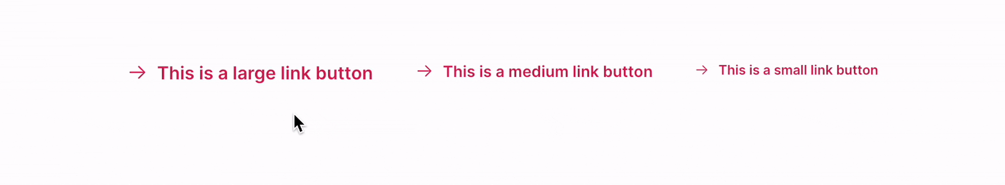
Changing the size
Different sizes could be configured for the FUIButtonLinkTextIcon, namely:
Large
Medium (default)
Small
This can be accomplished by configuring the fuiButtonSize parameter, which accepts values from the FUIButtonSize enumeration.
Enable/Disable Link Underline
To enable/disable underline when mouse is hovering on FUIButtonLinkTextIcon:
To change the text/icon while on hover:

Enabling / Disabling with Controller
The FUIButtonLinkTextIcon enables the control of button functionality through a controller.
This functionality can be accomplished by using the FUIButtonController controller.
Major Parameters
Parameters | Description |
|---|---|
Text text | The label text of the button. |
Icon? icon | The icon for the button link (if any). |
FUIButtonTextIconPosition fuiButtonTextIconPosition | The position of the label text and icon in the button. |
FUIColorScheme fuiColorScheme | The desired color scheme of the button. |
FUIButtonSize fuiButtonSize | The desired pre-configured size of the button |
FUIButtonController? fuiButtonController | The controller to toggle enable / disable for the button. |
Text? onHoverText | The label text of the button link when the mouse cursor is over the link. |
Icon? onHoverIcon | The icon of the button link when the mouse cursor is over the link. |
Other parameters
The other parameters corresponds to the ones available in TextButton.