Modal - FUIModal
The FUIModal, a modal component inspired by the popular HTML/Javascript Bootstrap library. This modal component features a header, body, and footer section, similar to the FUIPanel. Additionally, it incorporates pace bar and spinner functionality.
Widget Class Location
The FUIModal widget and other related classes could be found in the directory of:
Class Details
Class Name | Dart File | Description |
|---|---|---|
| fui_modal.dart | The major widget class of the modal. |
| fui_modal_events.dart | The controller for the FUIModal (using Flutter Bloc) |
| fui_modal_events.dart | The controller event class, used by FUIModalController. Any parameter that is |
| fui_modal_params.dart | The enum for certain settings in the modal, namely pace bar position. |
Widget Theme Location
The FUIModalTheme class is the theme class holds the default theme variables/values.
Accessing the theme
To access the theme class object, do the following:
Usage
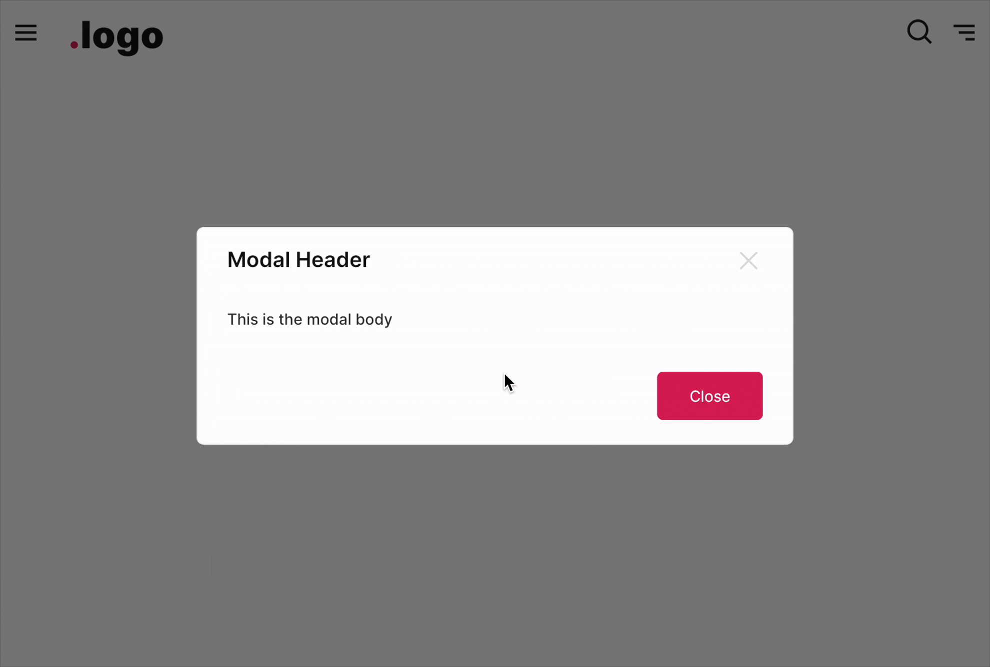
Below is a typical example of how to set up and display a modal.
A Stateful widget is highly recommended for initializing and using the modal controller.
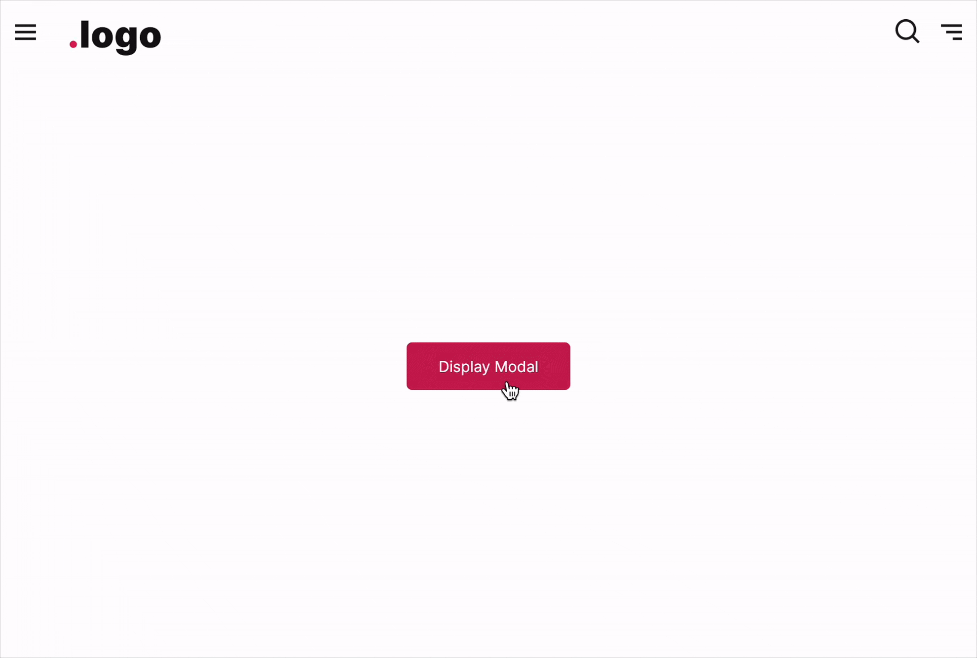
To display a Modal
The FUIModalController provides a static method named showFUIModal. This method accepts a BuildContext object and an instance of the modal to be displayed. To utilize this method, simply pass the required objects to it.
To close a Modal
To close a modal programmatically, always define and attach a modal controller for this purpose.
Changing the popup animation
The default animation for modal display is a fadeInDown animation. The animationType parameter can be used to change the display animation type.
Callback function after closing animation
Upon the modal’s closure (after the animation has been completed), a callback method can be assigned.
Header

The header consists of two distinct sections. The left side accommodates the header title, while the right side is reserved for the placement of an icon button, if applicable.
Showing / Hiding
The header’s visibility can be controlled using the headerShow property, while the header separator’s visibility can be controlled using the headerSeparator property.
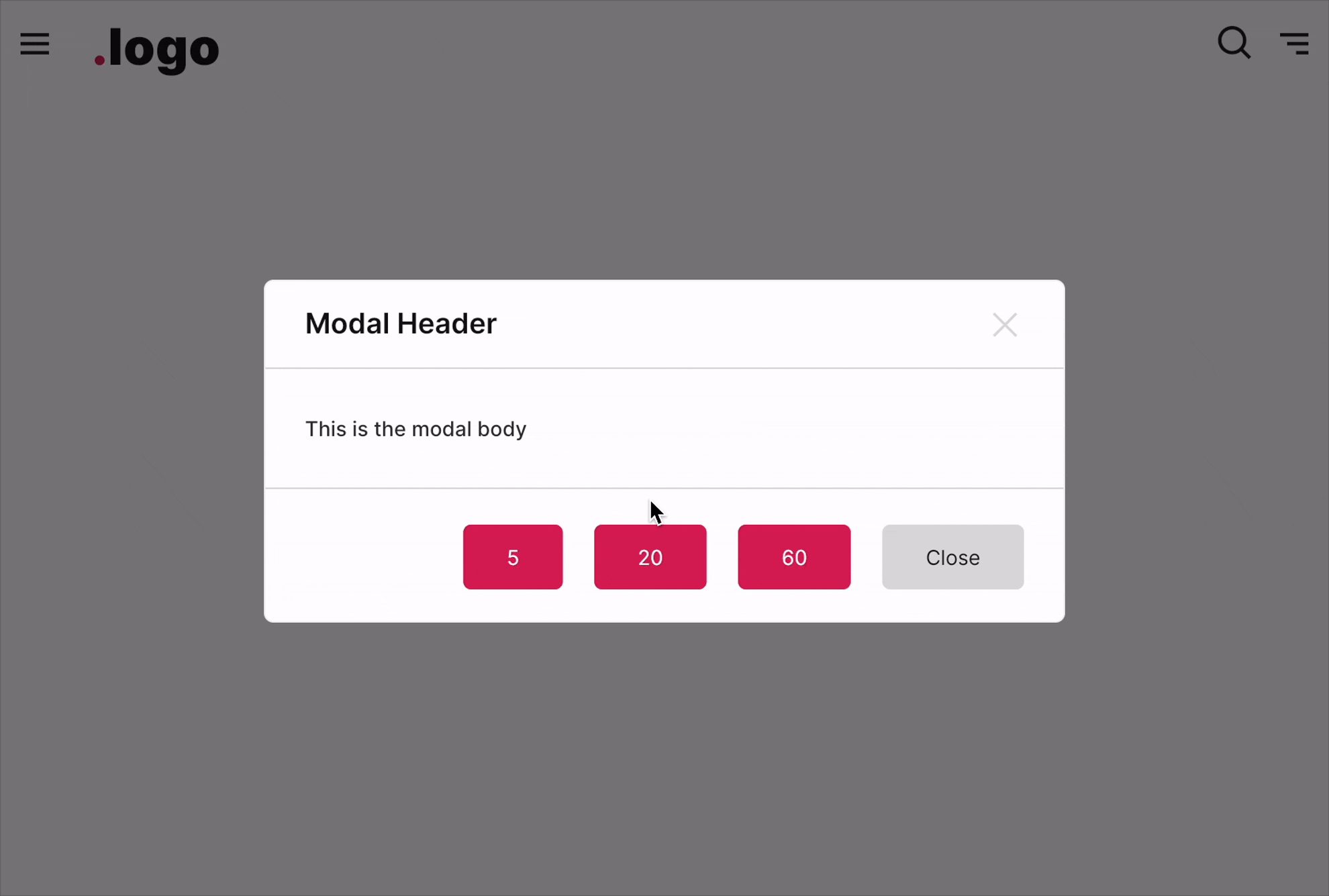
Footer

The footer is the section located below the content of the FUIModal. It typically contains action buttons or links. The footer buttons can be configured to be displayed on the side or with a custom widget that occupies the entire space ( block mode).
Footer buttons on the side
Footer with a custom widget

Instead of assigning the button widgets to the footerButtons, assign the footerWidget instead.
With controller
The FUIModal ’s PaceBar and Spinner can be programmatically controlled, similar to FUIPane or FUIPanel.
The PaceBar
To Enable / Disable PaceBar
If the paceBarEnable is disabled, displaying the PaceBar through the controller event will not have any effect.
Repeating PaceBar
The PaceBar on the FUIModal can be utilized to display task progress or serve as a decorative element. The PaceBar within the FUIModal comprises two modes: repeating and finite value (non-repeating).
Here is how to toggle a repeating PaceBar using a controller:
Definite Value (Non-Repeating) PaceBar
If you prefer manually setting the PaceBar’s value, it can be adjusted from 0 to 100 (maximum).
Example:
PaceBar Location
The PaceBar can be positioned at either the top or bottom of the panel. This configuration is controlled by the paceBarPosition parameter.
The Spinner
The spinner is an animated widget that serves as an indicator of the status of a task, such as waiting, loading, or processing.
Show / Hide Spinner
The spinner could be displayed or hidden using the controller.
To override settings of Modal - ModalEntry
For more control on modal display and the position on screen, do the following:
For more advanced and customized settings for Modal, please refer to the documentation at https://pub.dev/packages/modals, particularly the usage of ModalEntry.
Parameters
Parameters | Description |
|---|---|
FUIColorScheme fuiColorScheme | The color scheme for the side pace bar & spinner. The default is |
FUIModalController? fuiModalController | The controller to control the elements of the modal externally. |
double? width | Define a custom width for the modal. |
double? height | Define a custom height of the modal. |
Color? backgroundColor | The background color of the modal. |
double? borderThickness | The border thickness of the modal. |
Color? borderColor | The border color of the modal. |
BorderRadius? boxBorderRadius | The border corner radius of the modal. |
FUIAnimationType animationType | Define the animation type when the modal is displayed. Default is |
Duration animationDuration | The duration of the modal display animation. |
VoidCallback? onModalDisplayedAfterAnimation | The callback function after the animation is done when the modal is displayed. |
VoidCallback? onModalDismissedAfterAnimation | The callback function after the animation is done when the modal is dismissed. |
bool animationOnClose | Enable/disable animation upon dismiss. |
bool animationOnClose | Enable/disable animation upon dismiss. |
bool headerShow | Toggle modal header. |
Widget? header | The header of the modal. |
Widget? headerModalCloseIcon | Custom the header close icon button. |
bool headerSeparator | Toggle header separator. |
double? headerSeparatorThickness | The thickness of the header separator line. |
Color? headerSeparatorColor | Set this to override the header separator color. |
bool footerShow | Toggle footer at the bottom of the panel. |
List\<Widget\>? footerButtons | The footer buttons on the right side. |
Widget? footer | Set this if you want the widget to occupied the entire footer space (do not set the footerButtons if you are using this). |
EdgeInsets? footerPadding | The padding for the footer. |
bool footerSeparator | Toggle footer separator. |
double? footerSeparatorThickness | The thickness of the footer separator line. |
Color? footerSeparatorColor | Overrides the color of the footer separator. |
double? opacityDuringDisabled | The opacity value when the panel is disabled. The value should be between 0 to 1. |
Duration? opacityAniDuration | The animation duration when blurring on enable / disable. |
bool paceBarEnable | Set to |
bool paceBarShow | To show the pace bar initially when the |
bool paceBarRepeating | Set to |
FUIModalPaceBarPosition paceBarPosition | The position of the |
Color? paceBarColor | Overrides the PaceBar color. |
double paceBarCurrentValue | Defines the current value of the PaceBar (if it is not in repeating mode). |
double paceBarMaxValue | Defines the maximum value of the PaceBar (if it is not in repeating mode). Defaults to 100. |
Curve? paceBarAniCurve | Defines animation curve for the PaceBar animation during value change. |
Duration? paceBarAniDuration | Defines animation duration for the PaceBar animation during value change. |
bool spinnerEnable | To enable / disable the spinner. |
Alignment spinnerPosition | Defines the position of the spinner. Defaults to |
Widget? spinnerWidget | Overrides the spinner widget. You may use some other icons or Lottie widget for the spinner. |
bool spinnerRotationEnable | Enable / disable the rotation of the spinner. |
Duration? spinnerRotationAniDuration | This animation duration of the rotation of the spinner. |
Curve? spinnerRotationAniCurve | This animation curve of the rotation of the spinner. |