Pane - FUIPane

FUIPane is a container designed to accommodate multiple widgets within a single display area. It is characterized by its borderless design and transparent background by default. Additionally, it includes both PaceBar and Spinner widgets as default components.
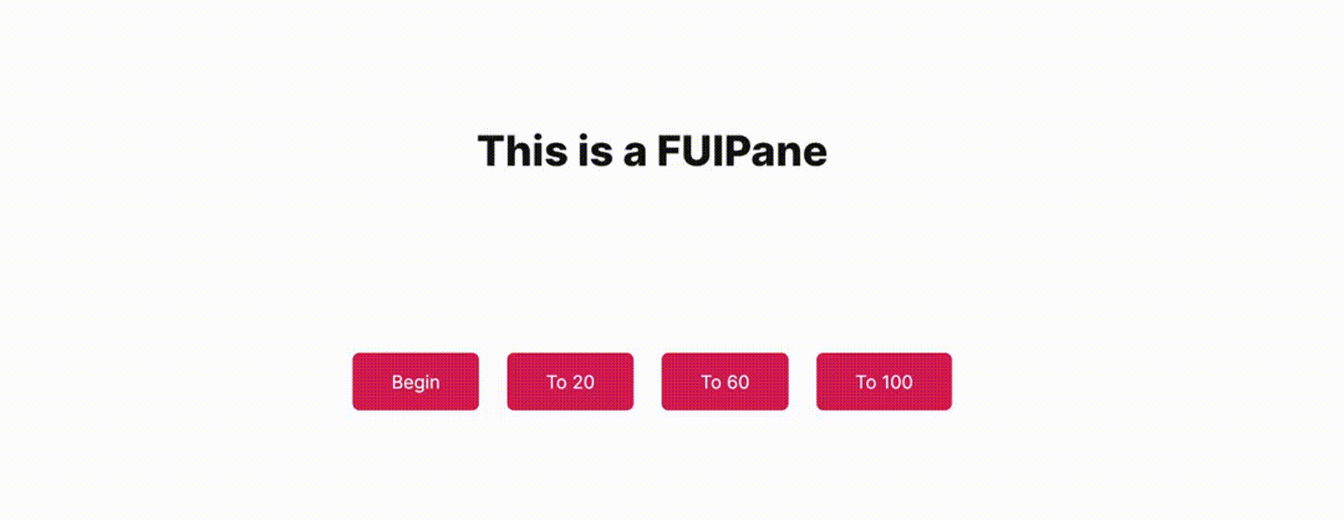
The above image shows a FUIPane with PaceBar enabled.
Widget Class Location
The FUIPane widget classes could be found in the directory of:
Class Details
Class Name | Dart File | Description |
|---|---|---|
| fui_pane.dart | The major widget class of the pane. |
| fui_pane_events.dart | The controller for the FUIPane (using Flutter Bloc) |
| fui_pane_events.dart | The controller event class, used by |
| fui_pane_params.dart | The enum for certain settings in the pane, namely pace bar position. |
Widget Theme Location
The FUIPaneTheme class is the theme class holds the default theme variables/values.
Accessing the theme
To access the theme class object, it can be done through:
Usage
Here's a typical usage for the FUIPane:
The FUIPane by default has a height of 400 pixels, with a small padding for its child content. You can explore other settings in the FUIPaneTheme class.
With controller
The FUIPane's PaceBar and Spinner could be controlled programmatically.
Initialize the FUIPaneController
Do this in a Stateful Widget.
The PaceBar
To Enable / Disable PaceBar
If the paceBarEnable is disabled, showing the PaceBar through the controller event will not take effect.
Repeating PaceBar
The PaceBar on the FUIPane can be utilized to display task progress or serve as a decorative element. The PaceBar within the FUIPane offers two modes: repeating and finite value (non-repeating).
Here's how to toggle a repeating PaceBar (via controller):

Definite Value (Non-Repeating) PaceBar
If you prefer manually setting the PaceBar’s value, it can be adjusted from 0 to 100 (maximum).
Example:
PaceBar Location
The PaceBar’s position can be placed at the top or bottom of the pane. This configuration is controlled by the paceBarPosition parameter.
The Spinner
The spinner is an animated widget that serves as an indicator of the status of a task, such as waiting, loading, or processing.
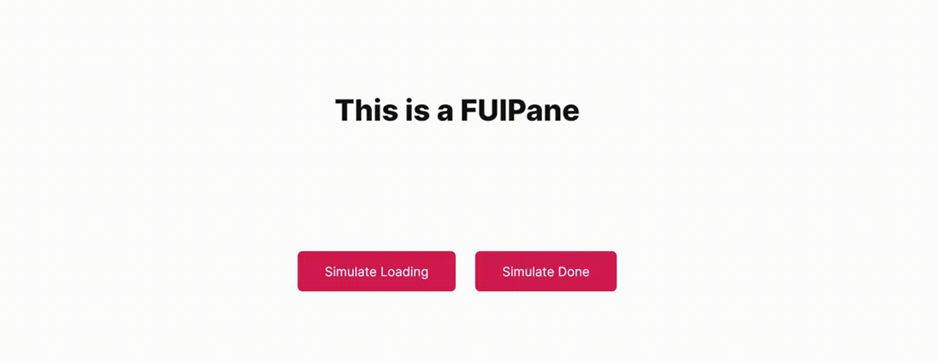
Show / Hide Spinner
The spinner could be shown and hidden via the controller.
Parameters
Parameters | Description |
|---|---|
FUIColorScheme fuiColorScheme | The color scheme for the side pace bar & spinner. The default is |
FUIPaneController? paneController | The controller to control the elements of the pane externally. |
double? width | Define the width of the pane. The default is maximum width of the outer container. |
double? height | Define the height of the pane. The default is 400. |
EdgeInsets? padding | Correspond to the |
BoxDecoration? decoration | Correspond to the |
BoxConstraints? constraints | Correspond to the |
double? opacityDuringDisabled | The opacity value when the pane is disabled. The value should be between 0 to 1. |
Duration? opacityAniDuration | The animation duration when blurring on enable / disable. |
bool paceBarEnable | Set to |
bool paceBarShow | To show the PaceBar initially when the FUIPane widget is rendered. |
bool paceBarRepeating | Set to |
FUIPanePaceBarPosition paceBarPosition | The position of the PaceBar, either at the top, or at the bottom (via enum |
Color? paceBarColor | Overrides the PaceBar color. |
double paceBarCurrentValue | Defines the current value of the PaceBar (if it is not in repeating mode). |
double paceBarMaxValue | Defines the maximum value of the PaceBar (if it is not in repeating mode). Defaults to 100. |
Curve? paceBarAniCurve | Defines animation curve for the PaceBar animation during value change. |
Duration? paceBarAniDuration | Defines animation duration for the PaceBar animation during value change. |
bool spinnerEnable | To enable / disable the spinner. |
Alignment spinnerPosition | Defines the position of the spinner. Defaults to |
Widget? spinnerWidget | Overrides the spinner widget. You may use some other icons or Lottie widget for the spinner. |
bool spinnerRotationEnable | Enable / disable the rotation of the spinner. |
Duration? spinnerRotationAniDuration | This animation duration of the rotation of the spinner. |
Curve? spinnerRotationAniCurve | This animation curve of the rotation of the spinner. |