Panel - FUIPanel

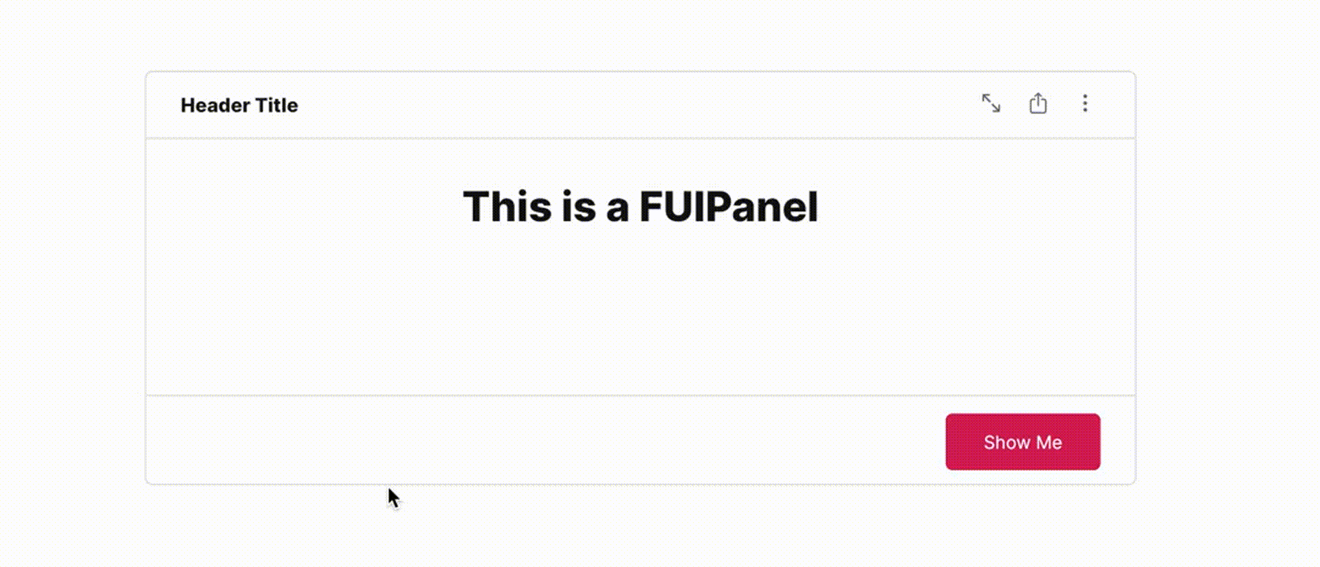
The FUIPanel is an advanced FUIPane. While FUIPane is a suitable container with a pace bar and spinners, FUIPanel enables the inclusion of a header title, icons centered content, and a footer within a bordered box.
Widget Class Location
The FUIPanel widget and other related classes could be found in the directory of:
Class Details
Class Name | Dart File | Description |
|---|---|---|
| fui_panel.dart | The major widget class of the panel. |
| fui_panel_events.dart | The controller for the FUIPanel (using Flutter Bloc) |
| fui_panel_events.dart | The controller event class, used by |
| fui_panel_params.dart | The enum for certain settings in the panel, namely pace bar position. |
Widget Theme Location
The FUIPanelTheme class is the theme class holds the default theme variables/values.
Accessing the theme
To access the theme class object, it can be done through:
Usage
Here's a typical usage for the FUIPanel:
Similar to the FUIPane, the FUIPanel also has a default height of 400 pixels, with a small padding for content displayed. You can explore other settings in the FUIPanelTheme class.
Header

The header consists of two distinct sections. The left side accommodates the header title, while the right side is reserved for the placement of an icon button, if applicable.
Showing / Hiding
The header’s visibility can be controlled using the headerShow property, while the header separator’s visibility can be controlled using the headerSeparator property.
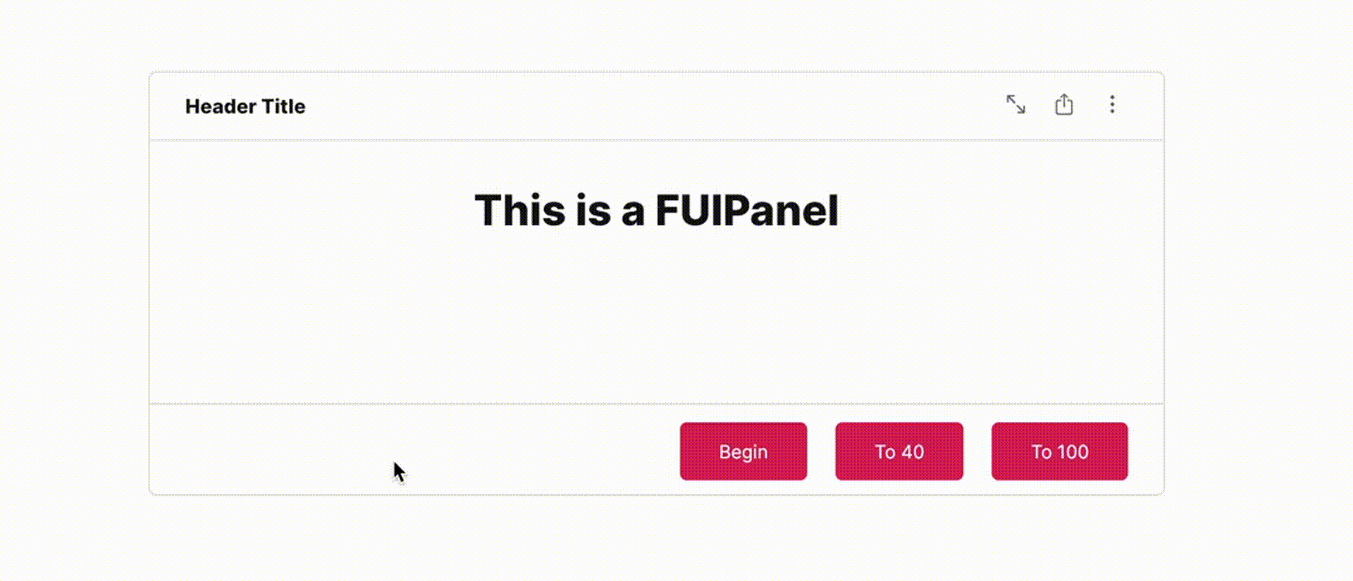
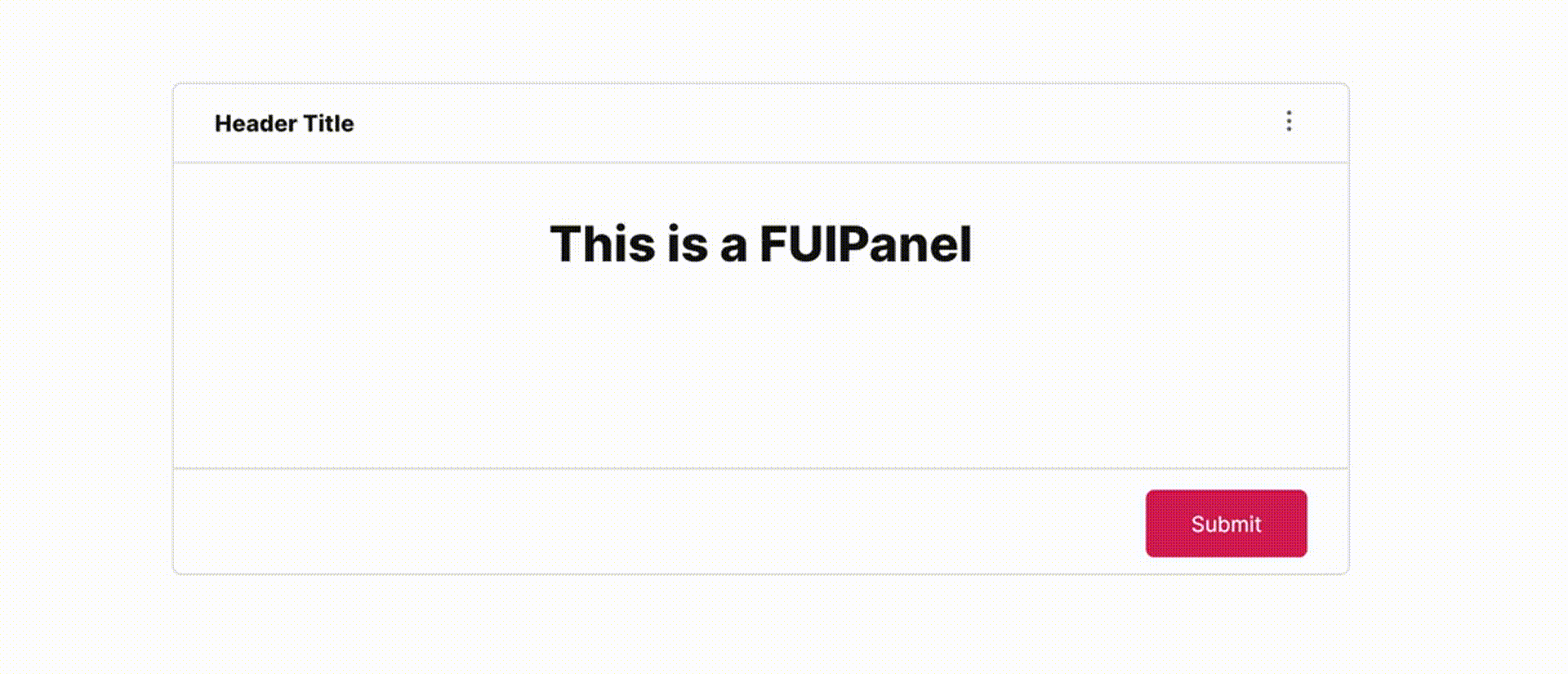
Footer

The footer is the section located below the content of the FUIPanel. It typically contains action buttons or links. The footer buttons can be configured to be displayed on the side or with a custom widget that occupies the entire space (block mode).
Footer buttons on the side
Footer with a custom widget

Instead of assigning the button widgets to the footerButtons, assign the footerWidget instead.
With controller
The FUIPanel's PaceBar and Spinner could be controlled programmatically, just like FUIPane.
Initialize the FUIPanelController
Do this in a Stateful Widget.
The PaceBar
To Enable / Disable PaceBar
If the paceBarEnable is disabled, displaying the PaceBar through the controller event will not have any effect.
Repeating PaceBar
The PaceBar on the FUIPanel can be utilized to display task progress or serve as a decorative element. The PaceBar within the FUIPanel offers two modes: repeating and finite value (non-repeating).
Here's how to toggle a repeating PaceBar (via controller):
Definite Value (Non-Repeating) PaceBar
If you prefer manually setting the PaceBar’s value, it can be adjusted from 0 to 100 (maximum).
Example:
PaceBar Location
The PaceBar can be positioned at either the top or bottom of the panel. This configuration is controlled by the paceBarPosition parameter.
The Spinner
The spinner is an animated widget that serves as an indicator of the status of a task, such as waiting, loading, or processing.
Show / Hide Spinner
The spinner could be shown and hidden via the controller.
Parameters
Parameters | Description |
|---|---|
FUIColorScheme fuiColorScheme | The color scheme for the side pace bar & spinner. The default is |
FUIPanelController? panelController | The controller to control the elements of the panel externally. |
double? width | Define the width of the panel. The default is maximum width of the outer container. |
double? height | Define the height of the panel. The default is 400. |
EdgeInsets? padding | Correspond to the |
BoxDecoration? decoration | Correspond to the |
BoxConstraints? constraints | Correspond to the |
Color? panelBackgroundColor | The background color of the panel. |
double? panelBorderThickness | The border thickness of the panel. |
Color? panelBorderColor | The border color of the panel. |
BorderRadius? panelBoxBorderRadius | The border corner radius of the panel. |
bool headerShow | Toggle panel header. |
Widget? header | The header (head title) of the panel. |
EdgeInsets? headerPadding | The header padding. |
List\<Widget\>? headerIconButtons | The header side icon buttons. |
bool headerSeparator | Toggle header separator. |
double? headerSeparatorThickness | The thickness of the header separator line. |
Color? headerSeparatorColor | Set this to override the header separator color. |
bool footerShow | Toggle footer at the bottom of the panel. |
List\<Widget\>? footerButtons | The footer buttons on the right side. |
Widget? footer | Set this if you want the widget to occupied the entire footer space (do not set the footerButtons if you are using this). |
EdgeInsets? footerPadding | The padding for the footer. |
bool footerSeparator | Toggle footer separator. |
double? footerSeparatorThickness | The thickness of the footer separator line. |
Color? footerSeparatorColor | Overrides the color of the footer separator. |
double? opacityDuringDisabled | The opacity value when the panel is disabled. The value should be between 0 to 1. |
Duration? opacityAniDuration | The animation duration when blurring on enable / disable. |
bool paceBarEnable | Set to |
bool paceBarShow | To show the pace bar initially when the |
bool paceBarRepeating | Set to |
FUIPanePaceBarPosition paceBarPosition | The position of the PaceBar, either at the top, or at the bottom (via enum |
Color? paceBarColor | Overrides the PaceBar color. |
double paceBarCurrentValue | Defines the current value of the PaceBar (if it is not in repeating mode). |
double paceBarMaxValue | Defines the maximum value of the PaceBar (if it is not in repeating mode). Defaults to 100. |
Curve? paceBarAniCurve | Defines animation curve for the PaceBar animation during value change. |
Duration? paceBarAniDuration | Defines animation duration for the PaceBar animation during value change. |
bool spinnerEnable | To enable / disable the spinner. |
Alignment spinnerPosition | Defines the position of the spinner. Defaults to |
Widget? spinnerWidget | Overrides the spinner widget. You may use some other icons or Lottie widget for the spinner. |
bool spinnerRotationEnable | Enable / disable the rotation of the spinner. |
Duration? spinnerRotationAniDuration | This animation duration of the rotation of the spinner. |
Curve? spinnerRotationAniCurve | This animation curve of the rotation of the spinner. |