Tag Input - FUIInputTags
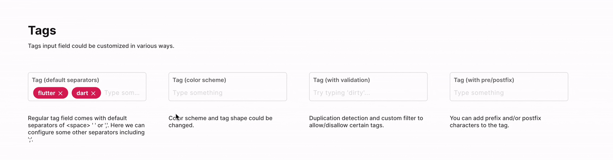
The FUIInputTags is an input box that transforms text values into bubble-like or square-like tags upon detecting a delimiter character.
Widget Class Location
The FUIInputTags widget classes could be found in:
Widget Theme Location
The FUIInputTags class is the theme class holds the default theme variables/values.
Accessing the theme
To access the theme class object, do the following:
Usage
A typical usage of the FUIInputTags would be as follows:
Changing the delimiter/separator
To modify the delimiter or separator, specify a desired list of characters that will serve as delimiters by utilizing the tagSeparators parameter.
Changing the shape of the tag
To alter the shape of the tag bubble, the fuiInputTagShape parameter can be utilized. This parameter accepts an FUIInputTagShape enum value.
Prefix and Postfix string for tag
If a prefix or a postfix string is desired to be displayed as part of the tag value, this can be accomplished by configuring the tagPrefixString and tagPostfixString parameters.
Obtaining the tag values
The onChanged method property will only return the current text in the input box, including the delimiter. To obtain the tag values in a list, the StringTagController must be utilized.
Validation
A pre-validation of tag value can be achieved by implementing the tagStringValidator function.
For instance, the tag value should NOT contain any numbers.
Parameters
Parameters | Description |
|---|---|
StringTagController? stringTagController | The controller for the currently available tags. |
Validator\<String\>? tagStringValidator | To validate is a give text value should be added as a legit tag. The return data - Null: all good. A string text message: error. |
List\<String\>? initialTags | The list of initial tags. |
List\<String\> tagSeparators | The list of tag separators / delimiters. |
String? tagPrefixString | The prefix string to be included to the tag value. |
String? tagPostfixString | The postfix string to be included to the tag value. |
TextStyle? tagTextStyle | Overrides the text style for the tag display text. |
Color? tagBackgroundColor | The background color for the tag box/bubble. |
FUIInputTagShape fuiInputTagShape | The shape of the tag - square or rounded. |
FUIColorScheme fuiColorScheme | The color scheme for the |
FUIInputFieldController? fuiInputFieldController | The controller for the input field. |
String? label | The input field label within the box. |
String? hint | The subtle hint text on the input field. |
bool mandatory | Toggle the display of mandatory indicator. |
Widget? mandatoryIndicator | A custom mandatory indicator (if needed). |
bool showTopLabelBar | Toggle the display of the top label. |
String? initialValue | The initial value (or assign it via textEditingController). |
FUIInputSize fuiInputSize | The size of the input box, accepts values from |
FUIInputStatusType fuiInputStatusType | The status type of the input box. |
String? fuiInputStatusText | The status type text (if any). |
Widget? sideIcon | The decorative side icon (if any). |
FUIInputSideIconPosition fuiInputSideIconPosition | The position of the side icon. |
Color? sideIconBackgroundColor | The background color of the side icon portion. |