Drop-Down Select - FUIInputSelect
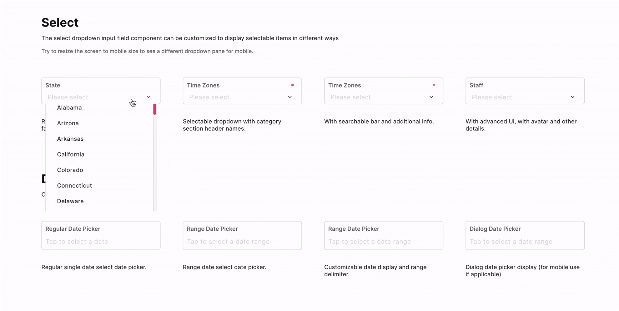
The FUIInputSelect is a versatile drop-down select input box that offers a range of functionalities. It can be customized to provide a basic drop-down select box or an enhanced display for selectable items.
Widget Class Location
The FUIInputSelect widget classes could be found in:
Widget Theme Location
The FUIInputSelect class is the theme class holds the default theme variables/values.
Accessing the theme
To access the theme class object, do the following:
Usage

To populate the dataList with SingleCategoryModel and SingleItemCategoryModel, we need to create a list of items for the select box.
The selectedDataList parameter is the pre-selected SingleItemCategoryModel. This SingleItemCategoryModel with the same value must already be present in the dataList.
With / without search
The search/filter box is enabled by default when the drop-down list appears.
To toggle the availability of search/filter bar:
Categorized item list
To group selectable items into categories, do the following:
Extra info on item

To display additional information in the SingleItemCategoryModel, the extraInfoInDropdown parameter must be set to true. Subsequently, a string description value must be assigned to the extraInfoSingleItem field within the SingleItemCategoryModel.
With avatar

The avatar (or any other side item widget) could be included as part of the selectable item or the selected item.
Please assign the avatarSingleItem parameter with an FUIAvatar widget (or any other widget) in the SingleItemCategoryModel.
If the avatarInSingleSelect parameter is set to true, the avatar will be displayed alongside the selected item. Conversely, if avatarInSingleSelect is set to false, only the value specified in nameSingleItem will be displayed.
Doing things with Controller - FUIInputFieldSelectController
The FUIInputFieldSelectController is largely similar to FUIInputFieldController, with some additional parameters to facilitate the programmatic selection operation.
The FUIInputFieldSelectEvent is the event class for the trigger method in FUIInputFieldSelectController.
Initializing the FUIInputFieldSelectController
Programmatic Population of Data List
Both the dataList and the selectedDataList could be re-populated as the following:
The other functionalities are similar to FUIInputText, as documented in Text Input - FUIInputText.
Parameters
Parameters | Description |
|---|---|
List\<SingleCategoryModel\> dataList | The selectable data item list - |
List\<SingleItemCategoryModel\>? selectedDataList | The selected item list (should only be one item for now). |
bool isSearchable | Toggle search filter box. |
bool avatarInSingleSelect | Toggle avatar for single selected item. |
bool extraInfoInDropdown | Toggle extra info for item. |
FUIInputFieldController? fuiInputFieldController | The controller for the input field. |
String? label | The input field label within the box. |
String? hint | The subtle hint text on the input field. |
bool mandatory | Toggle the display of mandatory indicator. |
Widget? mandatoryIndicator | A custom mandatory indicator (if needed). |
bool showTopLabelBar | Toggle the display of the top label. |
String? initialValue | The initial value (or assign it via textEditingController). |
FUIInputSize fuiInputSize | The size of the input box, accepts values from |
FUIInputStatusType fuiInputStatusType | The status type of the input box. |
String? fuiInputStatusText | The status type text (if any). |
Widget? sideIcon | The decorative side icon (if any). |
FUIInputSideIconPosition fuiInputSideIconPosition | The position of the side icon. |
Color? sideIconBackgroundColor | The background color of the side icon portion. |
Other parameters
The other parameters corresponds to the ones available in FUIInputText.