Date Input - FUIInputDate
This input field is designed to accept dates. When the user taps or clicks on the field, a date picker will be displayed to facilitate the selection of a date.
Widget Class Location
The FUIInputDate widget classes could be found in:
Widget Theme Location
The FUIInputTheme class is the theme class holds the default theme variables/values.
Accessing the theme
To access the theme class object, do the following:
Usage
Here's how to have the FUIInputDate widget declared.
Date Format
An alternative date format can be assigned using the dateFormat property. The format syntax is documented in: DateFormat.
A quick example:
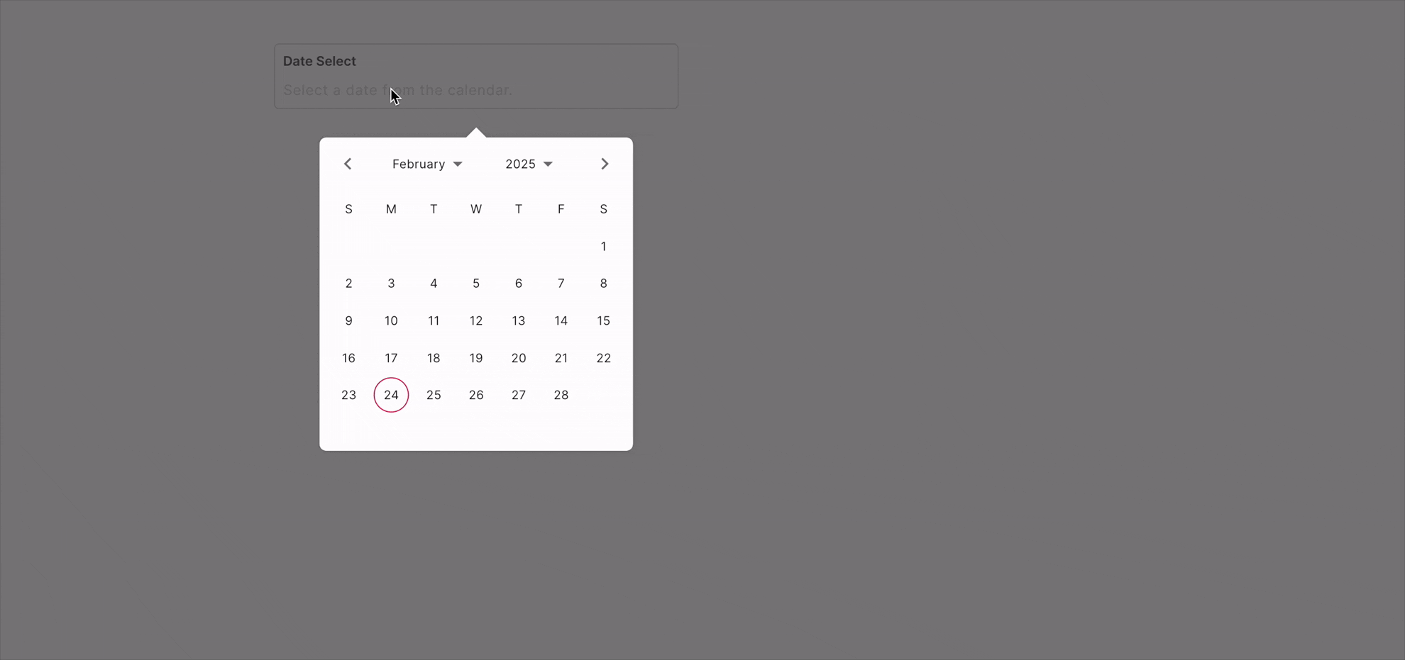
Displaying the date picker
There are two distinct modes of calendar selection panel display:
popover
dialog
The display mode can be configured via the fuiPickerDisplayMode, which accepts values from the FUIPickerDisplayMode enum.
Date Range
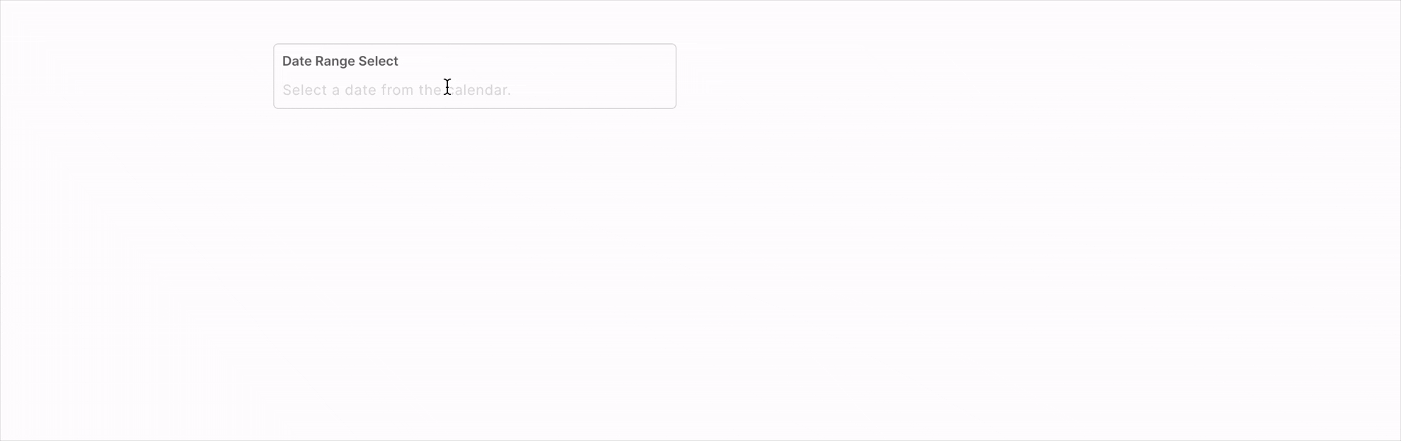
The FUIInputDate also allow the selection of a date range rather than a single date. To configure the FUIInputDate for range selection, utilize the calendarDatePicker2Type parameter, which accepts values from the CalendarDatePicker2Type enum.
Date Range Delimiter
By default, the delimiter or separator for date ranges is the hyphen (-). To use a custom delimiter, configure it via the dateRangeDelimiter parameter, as follows:
Multiple Dates

The FUIInputDate can be configured to select multiple isolated dates, as demonstrated below:
Doing things with Controller - FUIInputFieldController
The use of FUIInputFieldController is similar to the FUIInputText widget. Please refer to the section on Text Input - FUIInputText.
Parameters
Parameters | Description |
|---|---|
CalendarDatePicker2Type calendarDatePicker2Type | The mode of selection. Either single, range or multi (from calendar_date_picker2). |
String dateFormat | The desire resulting date format (according to DateFormat class). |
String dateRangeDelimiter | For the delimiter / separator for range selection. |
FUIPickerDisplayMode fuiPickerDisplayMode | Select either popover or dialog for the picker display. |
FUIInputFieldController? fuiInputFieldController | The controller for the input field. |
String? label | The input field label within the box. |
String? hint | The subtle hint text on the input field. |
bool mandatory | Toggle the display of mandatory indicator. |
Widget? mandatoryIndicator | A custom mandatory indicator (if needed). |
bool showTopLabelBar | Toggle the display of the top label. |
String? initialValue | The initial value (or assign it via textEditingController). |
FUIInputSize fuiInputSize | The size of the input box, accepts values from |
FUIInputStatusType fuiInputStatusType | The status type of the input box. |
String? fuiInputStatusText | The status type text (if any). |
Widget? sideIcon | The decorative side icon (if any). |
FUIInputSideIconPosition fuiInputSideIconPosition | The position of the side icon. |
Color? sideIconBackgroundColor | The background color of the side icon portion. |
Other parameters
The other parameters corresponds to the ones available in TextFormField.